Statistics Fundamentals
 Photo by MARIOLA GROBELSKA
This is the second part of the series Mathematics for Machine Learning with Python.
Data Introduction
For types of data, we can represent them as qualitative or quantitative data.
- Qualitative: it's a type of categorical data. It's used to categorize or identify the observed data
- Nominal: data that can be labelled or classified into mutually exclusive categories within a variable
- Ordinal:data that have natural, ordered categories
- Quantitative: it indicates some kind of quantitative or measurement
- Discrete: a type of quantitative data that includes nondivisible figures and statistics you can count
- Continuous: measurements that if placed on a number scale, can be placed in an infinite number of spaces between two whole numbers
Population vs Samples
- Population is the whole
- Sample is a subset of the population
Different types of data visualization
- Bar charts: a bar chart is a good way to compare numeric quantities or counts across categories
- Histograms: an histogram chart is good for continous data, so the chart doesn't show a bar for each individual value, but rather a bar for each range of binned values
- Pie charts: make it easy to compare relative quantities by categories
- Scatter plots: it's helpful for identifying apparent relationships between numeric features
- Line charts: a line chart is a great way to see changes in values along a series based on a time period
Statistics Fundamentals
One of the important topics in statistics is understanding the distribution of data in a sample. To be able to have this understanding, we need to learn the "Measures of Central Tendency", which's basically where the middle value in the data is. There are different ways of approaching this.
Let's start with this example of comparative salaries of people:
| Name | Salary |
|---|---|
| Dan | 50,000 |
| Joann | 54,000 |
| Pedro | 50,000 |
| Rosie | 189,000 |
| Ethan | 55,000 |
| Vicky | 40,000 |
| Frederic | 59,000 |
Mean
Mean is also called "average". This is calculated as the sum of the values in the dataset, divided by the number of observations in the dataset.
For the list of salaries, we can calculate it as:
We can use the mean method from Pandas in Python:
import pandas as pd

df = pd.DataFrame({'Name': ['Dan', 'Joann', 'Pedro', 'Rosie', 'Ethan', 'Vicky', 'Frederic'],
                   'Salary':[50000,54000,50000,189000,55000,40000,59000]})

df['Salary'].mean() # 71000.0
Median
To calculate the median, we:
- sort the values in ascending order
- find the middle value
- if there are an odd number of observations, you find the middle value using this formula
- if the number of observation is even, we calculate the median as the average of the two middle-most values:
For the list of salaries, we have an odd number of observations (7), so to get the position of the median value, we just need to calculate like this: (7 + 1) / 2 = 4, which's the salary 54,000.
| Salary |
|---|
| 40,000 |
| 50,000 |
| 50,000 |
| >54,000 |
| 55,000 |
| 59,000 |
| 189,000 |
In Python, we have the method median:
df = pd.DataFrame({'Name': ['Dan', 'Joann', 'Pedro', 'Rosie', 'Ethan', 'Vicky', 'Frederic'],
                   'Salary':[50000,54000,50000,189000,55000,40000,59000]})

df['Salary'].median() # 54000.0
Mode
Mode indicates the most frequently occurring value. Looking at the salaries list, we notice that the salary 50,000 is most frequant one, and so, it's the mode.
| Salary |
|---|
| 40,000 |
| >50,000 |
| >50,000 |
| 54,000 |
| 55,000 |
| 59,000 |
| 189,000 |
In Python, we also have a method called mode:
df = pd.DataFrame({'Name': ['Dan', 'Joann', 'Pedro', 'Rosie', 'Ethan', 'Vicky', 'Frederic'],
                   'Salary':[50000,54000,50000,189000,55000,40000,59000]})

df['Salary'].mode() # 50000
We can also have multimodal data, where the list has more than 1 mode. The mode method returns a list of all modes in the data.
Distribution & Density
It's important not only to find the center but also how the data is distrbuted. First starting with the minimum and maximum values.
df = pd.DataFrame({'Name': ['Dan', 'Joann', 'Pedro', 'Rosie', 'Ethan', 'Vicky', 'Frederic'],
                   'Salary':[50000,54000,50000,189000,55000,40000,59000]})

print('Min: ' + str(df['Salary'].min())) # Min: 40000
print('Mode: ' + str(df['Salary'].mode()[0])) # Mode: 50000
print('Median: ' + str(df['Salary'].median())) # Median: 54000.0
print('Mean: ' + str(df['Salary'].mean())) # Mean: 71000.0
print('Max: ' + str(df['Salary'].max())) # Max: 189000
Looking at this information, we can have a sense of how the data is distrbuted. But we can also use graphs to have a visually understanding of it.
import pandas as pd
import matplotlib.pyplot as plt

df = pd.DataFrame({'Name': ['Dan', 'Joann', 'Pedro', 'Rosie', 'Ethan', 'Vicky', 'Frederic'],
                   'Salary':[50000,54000,50000,189000,55000,40000,59000]})

salary = df['Salary']
salary.plot.hist(title='Salary Distribution', color='lightblue', bins=25)
plt.axvline(salary.mean(), color='magenta', linestyle='dashed', linewidth=2)
plt.axvline(salary.median(), color='green', linestyle='dashed', linewidth=2)
plt.show()
It plots this graph:
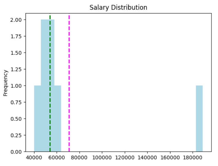
Here's an interpretation of this graph:
- The
meanis the magenta dashed line - The
medianis the green dashed line - Salary is a continuous data value - graduates could potentially earn any value along the scale, even down to a fraction of cent.
- The number of bins in the histogram determines the size of each salary band for which we're counting frequencies. Fewer bins means merging more individual salaries together to be counted as a group.
- The majority of the data is on the left side of the histogram, reflecting the fact that most graduates earn between 40,000 and 55,000
- The mean is a higher value than the median and mode.
- There are gaps in the histogram for salary bands that nobody earns.
Let's see a new example to understand the density and the distribution.
| Name | Grade |
|---|---|
| Dan | 50 |
| Joann | 50 |
| Pedro | 46 |
| Rosie | 95 |
| Ethan | 50 |
| Vicky | 5 |
| Frederic | 57 |
Let's plot this data with Python and check the shape of the distribution:
import pandas as pd
import matplotlib.pyplot as plt
import numpy as np
import scipy.stats as stats

df = pd.DataFrame({'Name': ['Dan', 'Joann', 'Pedro', 'Rosie', 'Ethan', 'Vicky', 'Frederic'],
                   'Grade':[50,50,46,95,50,5,57]})

grade = df['Grade']
density = stats.gaussian_kde(grade)
n, x, _ = plt.hist(grade, histtype='step', bins=25)
plt.plot(x, density(x)*7.5)
plt.axvline(grade.mean(), color='magenta', linestyle='dashed', linewidth=2)
plt.axvline(grade.median(), color='green', linestyle='dashed', linewidth=2)
plt.show()
It plots this graph:
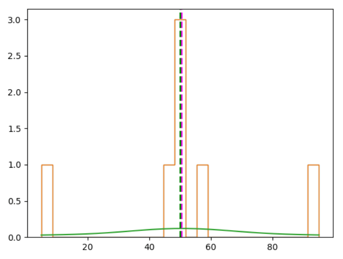
It forms this bell-shaped curve. It's usually called a "normal distribution", or Gaussian distribution.
Variance
We have different ways of quantifying the variance in a dataset:
- range: the difference between the highest and lowest values
- percentile: the ranking of a value in the overall distribution. e.g. 25% of the data in a distribution has a value lower than the 25th percentile
- quartiles: divide the percentiles in 4 slots (quartiles) - 0 > 25% > 50% > 75%
Standard Deviation
Variance is measured as the average of the squared difference from the mean.
For full population, we calculate with this formula:
For a sample:
As an example, let's calculate the variance for the grades data.
First we need to calculate the mean
Then apply it to the variance formula:
Resulting in:
In Python, we can use the method var:
import pandas as pd

df = pd.DataFrame({'Name': ['Dan', 'Joann', 'Pedro', 'Rosie', 'Ethan', 'Vicky', 'Frederic'],
                   'Salary':[50000,54000,50000,189000,55000,40000,59000],
                   'Hours':[41,40,36,17,35,39,40],
                   'Grade':[50,50,46,95,50,5,57]})

df['Grade'].var() # 685.6190476190476
The higher the variance, the more spread your data is around the mean.
In the variance calculation, we square the difference from the mean. That way, we are in a different unit of measurement as the original data.
To get the measure of variance back into the same unit of measurement, we need to find its square root:
This represents the standard deviation.
In Python, we have the std method to calculate the standard deviation:
df = pd.DataFrame({'Name': ['Dan', 'Joann', 'Pedro', 'Rosie', 'Ethan', 'Vicky', 'Frederic'],
                   'Salary':[50000,54000,50000,189000,55000,40000,59000],
                   'Hours':[41,40,36,17,35,39,40],
                   'Grade':[50,50,46,95,50,5,57]})

print(df['Grade'].std()) # 26.184328282754315
Let's plot a histogram of a standard normal distribution in Python:
import pandas as pd
import matplotlib.pyplot as plt
import numpy as np
import scipy.stats as stats

# Create a random standard normal distribution
df = pd.DataFrame(np.random.randn(100000, 1), columns=['Grade'])

# Plot the distribution as a histogram with a density curve
grade = df['Grade']
density = stats.gaussian_kde(grade)
n, x, _ = plt.hist(grade, color='lightgrey', bins=100)
plt.plot(x, density(x))

# Get the mean and standard deviation
std = df['Grade'].std()
mean = df['Grade'].mean()

# Annotate 1 stdev
x1 = [mean-std, mean+std]
y1 = [0.25, 0.25]
plt.plot(x1,y1, color='magenta')
plt.annotate('1s (68.26%)', (x1[1],y1[1]))

# Annotate 2 stdevs
x2 = [mean-(std*2), mean+(std*2)]
y2 = [0.05, 0.05]
plt.plot(x2,y2, color='green')
plt.annotate('2s (95.45%)', (x2[1],y2[1]))

# Annotate 3 stdevs
x3 = [mean-(std*3), mean+(std*3)]
y3 = [0.005, 0.005]
plt.plot(x3,y3, color='orange')
plt.annotate('3s (99.73%)', (x3[1],y3[1]))

# Show the location of the mean
plt.axvline(grade.mean(), color='grey', linestyle='dashed', linewidth=1)
plt.show()
Here's the graph:
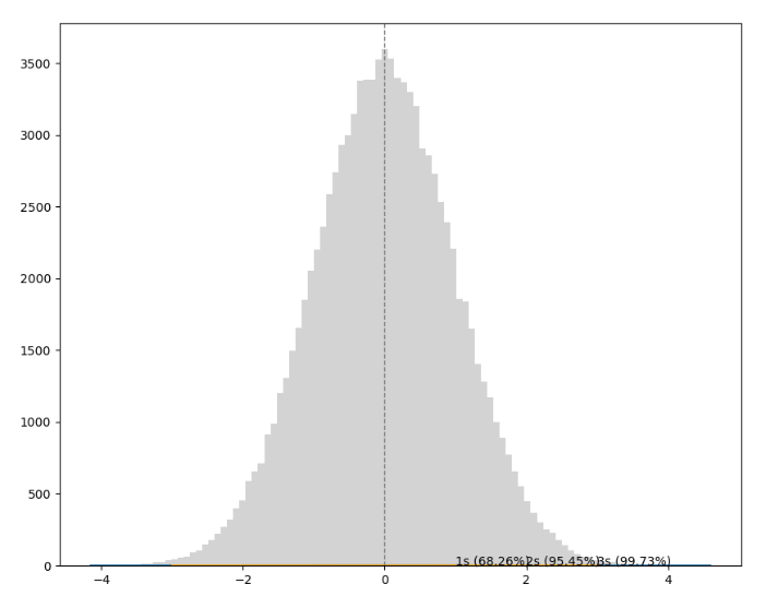
In any normal distribution:
- Approximately 68.26% of values fall within one standard deviation from the mean.
- Approximately 95.45% of values fall within two standard deviations from the mean.
- Approximately 99.73% of values fall within three standard deviations from the mean.
With all this knowledge, we have a simple way of getting all this information in Python. We use the describe method from pandas.
import pandas as pd

df = pd.DataFrame({'Name': ['Dan', 'Joann', 'Pedro', 'Rosie', 'Ethan', 'Vicky', 'Frederic'],
                   'Salary':[50000,54000,50000,189000,55000,40000,59000],
                   'Hours':[41,40,36,17,35,39,40],
                   'Grade':[50,50,46,95,50,5,57]})

df.describe()
#               Salary      Hours      Grade
# count       7.000000   7.000000   7.000000
# mean    71000.000000  35.428571  50.428571
# std     52370.475143   8.423324  26.184328
# min     40000.000000  17.000000   5.000000
# 25%     50000.000000  35.500000  48.000000
# 50%     54000.000000  39.000000  50.000000
# 75%     57000.000000  40.000000  53.500000
# max    189000.000000  41.000000  95.000000
Comparing Data
Comparing data is important so we can find trends and relationships among them.
When we talk about comparing data, we have two different types of data
- Univariate data: when we have only one variable
- Bivariate or Multivariate data: when we have more than 1 variable in the dataset
Bivariate or Multivariate data
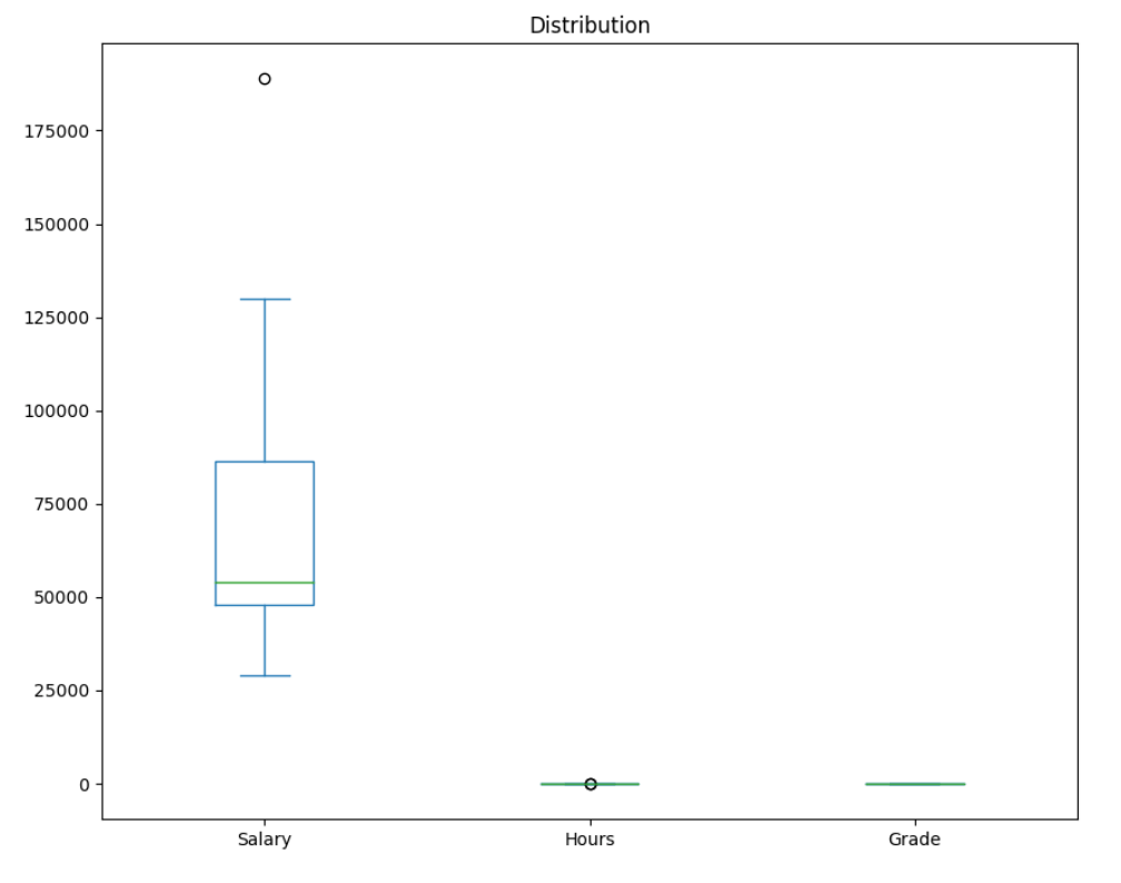
When comparing multiple variables, the difficult is to have them in different scales.
Let's see this in practice with Python:
import pandas as pd
from matplotlib import pyplot as plt
df = pd.DataFrame({'Name': ['Dan', 'Joann', 'Pedro', 'Rosie', 'Ethan', 'Vicky', 'Frederic', 'Jimmie', 'Rhonda', 'Giovanni', 'Francesca', 'Rajab', 'Naiyana', 'Kian', 'Jenny'],
'Salary':[50000,54000,50000,189000,55000,40000,59000,42000,47000,78000,119000,95000,49000,29000,130000],
'Hours':[41,40,36,17,35,39,40,45,41,35,30,33,38,47,24],
'Grade':[50,50,46,95,50,5,57,42,26,72,78,60,40,17,85]})
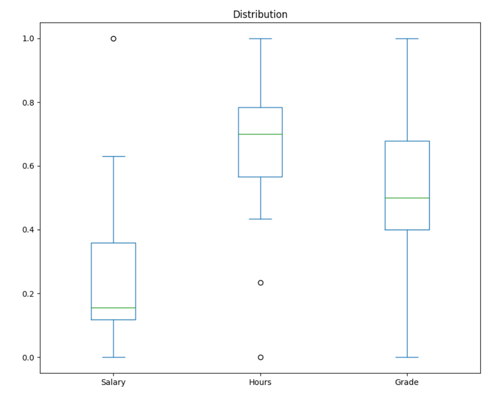
df.plot(kind='box', title='Distribution', figsize = (10,8))
plt.show()
Here we plot the data of salary, hours, and grades in the same graph, but the 3 are in different scales.
It's clear in the following graph that the salary data is so much bigger than the hours and grades data making it difficult to draw any conclusion from the graph.
To make the data and the graph more understandable, we normalize the data to compare different units of measurement.
In Python, we can use the MinMaxScaler from sklearn to normalize the data:
import pandas as pd
from matplotlib import pyplot as plt
from sklearn.preprocessing import MinMaxScaler

df = pd.DataFrame({'Name': ['Dan', 'Joann', 'Pedro', 'Rosie', 'Ethan', 'Vicky', 'Frederic', 'Jimmie', 'Rhonda', 'Giovanni', 'Francesca', 'Rajab', 'Naiyana', 'Kian', 'Jenny'],
                   'Salary':[50000,54000,50000,189000,55000,40000,59000,42000,47000,78000,119000,95000,49000,29000,130000],
                   'Hours':[41,40,36,17,35,39,40,45,41,35,30,33,38,47,24],
                   'Grade':[50,50,46,95,50,5,57,42,26,72,78,60,40,17,85]})

# Normalize the data
scaler = MinMaxScaler()
df[['Salary', 'Hours', 'Grade']] = scaler.fit_transform(df[['Salary', 'Hours', 'Grade']])

# Plot the normalized data
df.plot(kind='box', title='Distribution', figsize = (10,8))
plt.show()
Here's the new graph with the data normalized making it easier to interpret it:
Scatter plot
To compare numeric values, scatter plots can be very useful to check apparent relationship between them.
Let's code this scatter plot graph:
import pandas as pd
from matplotlib import pyplot as plt
df = pd.DataFrame({'Name': ['Dan', 'Joann', 'Pedro', 'Rosie', 'Ethan', 'Vicky', 'Frederic', 'Jimmie', 'Rhonda', 'Giovanni', 'Francesca', 'Rajab', 'Naiyana', 'Kian', 'Jenny'],
'Salary':[50000,54000,50000,189000,55000,40000,59000,42000,47000,78000,119000,95000,49000,29000,130000],
'Hours':[41,40,36,17,35,39,40,45,41,35,30,33,38,47,24],
'Grade':[50,50,46,95,50,5,57,42,26,72,78,60,40,17,85]})
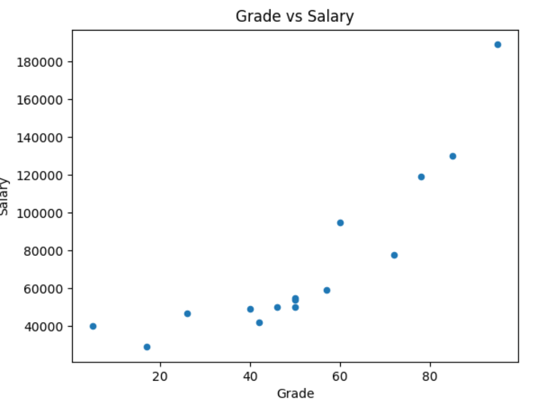
# Create a scatter plot of Salary vs Grade
df.plot(kind='scatter', title='Grade vs Hours', x='Grade', y='Salary')
plt.show()
If we look close, we can see a pattern in the graph, a diagonal rising to the right. In other words, the higher the grade, the higher the salary is.
If it's not clear for you, we can draw the line of best fit (trendline) in the graph to make it easier.
import pandas as pd
import numpy as np
from matplotlib import pyplot as plt

df = pd.DataFrame({'Name': ['Dan', 'Joann', 'Pedro', 'Rosie', 'Ethan', 'Vicky', 'Frederic', 'Jimmie', 'Rhonda', 'Giovanni', 'Francesca', 'Rajab', 'Naiyana', 'Kian', 'Jenny'],
                   'Salary':[50000,54000,50000,189000,55000,40000,59000,42000,47000,78000,119000,95000,49000,29000,130000],
                   'Hours':[41,40,36,17,35,39,40,45,41,35,30,33,38,47,24],
                   'Grade':[50,50,46,95,50,5,57,42,26,72,78,60,40,17,85]})

# Create a scatter plot of Salary vs Grade
df.plot(kind='scatter', title='Grade vs Salary', x='Grade', y='Salary')

# Add a line of best fit
plt.plot(np.unique(df['Grade']), np.poly1d(np.polyfit(df['Grade'], df['Salary'], 1))(np.unique(df['Grade'])))
plt.show()
This Python code generates this graph with the trendline:
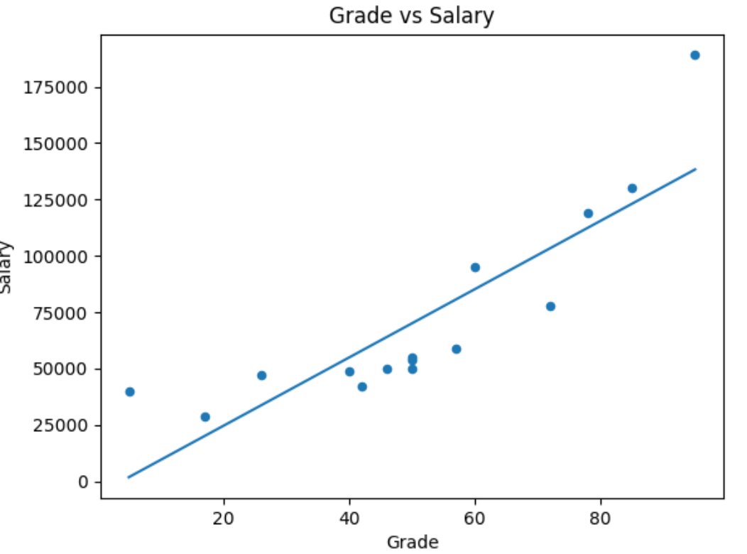
The line of best fit makes it clearer that there is some apparent colinearity between these variables (the relationship is colinear if one variable's value increases or decreases in line with the other).
Correlation
We can spot the relationship of variables in a graph but if we want to quantify the relationship between two variables, we can use the idea of correlation.
The correlation value is always a number between -1 and 1. This is how we interpret it:
- A positive value indicates a positive correlation (as the value of variable x increases, so does the value of variable y).
- A negative value indicates a negative correlation (as the value of variable x increases, the value of variable y decreases).
- The closer to zero the correlation value is, the weaker the correlation between x and y.
- A correlation of exactly zero means there is no apparent relationship between the variables.
The formula to calculate correlation is:
The r𝓍,𝔂 is the notion for the correlation between variables x and y.
In Python, we can calculate the correlation using the corr method from Pandas.
df = pd.DataFrame({'Name': ['Dan', 'Joann', 'Pedro', 'Rosie', 'Ethan', 'Vicky', 'Frederic'],
                   'Salary':[50000,54000,50000,189000,55000,40000,59000],
                   'Hours':[41,40,36,17,35,39,40],
                   'Grade':[50,50,46,95,50,5,57]})

df['Grade'].corr(df['Salary']) # 0.8149286388911882
Least squares regression
Linear equations look like this:
y and x are the coordinate variables, m is the slope of the line, and b is the y-intercept of the line.
The difference between the original y (Hours) value and the f(x) value is the error between our regression line of best fit and the actual Hours.
The first part is to calculate the slope and intercept for a line with the lowest overall error.
And then we define the overall error by taking the error for each point, squaring it, and adding all the squared errors together. The line of best fit is the line that gives us the lowest value for the sum of the squared errors - least squares regression.
Here's how we calculate the slope (m), which we do using this formula (in which n is the number of observations in our data sample):
After we've calculated the slope (m), we can use is to calculate the intercept (b) like this:
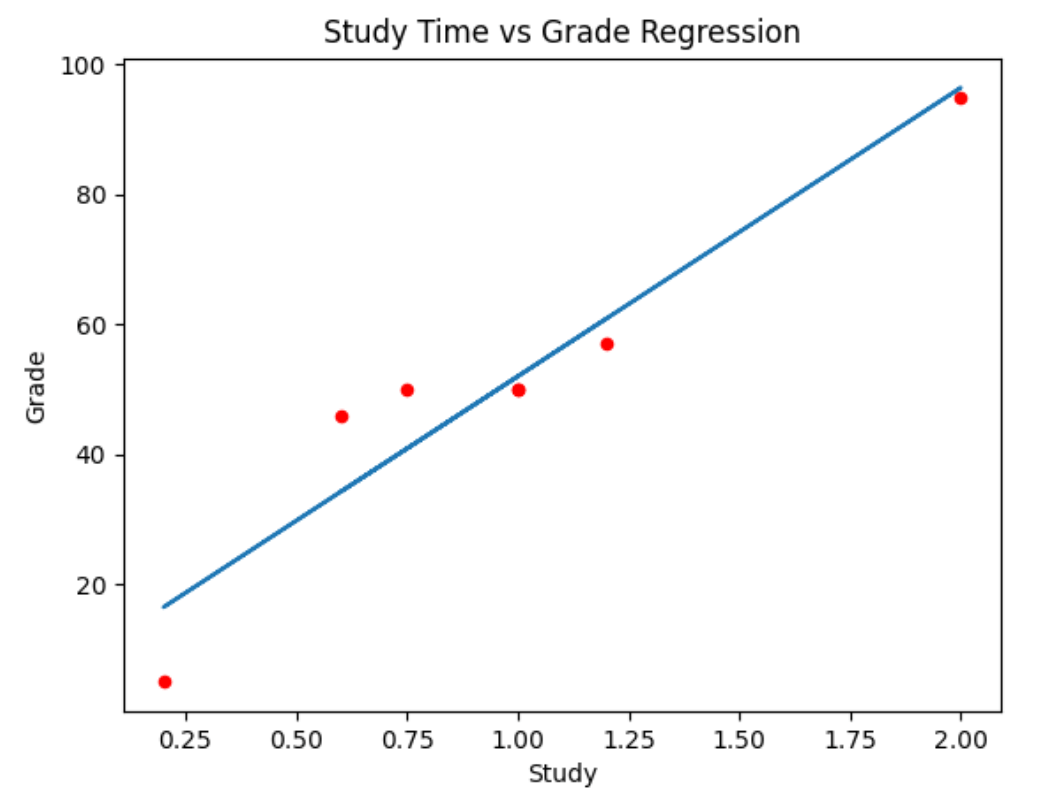
If we take this dataset as an example:
| Name | Study | Grade |
|---|---|---|
| Dan | 1 | 50 |
| Joann | 0.75 | 50 |
| Pedro | 0.6 | 46 |
| Rosie | 2 | 95 |
| Ethan | 1 | 50 |
| Vicky | 0.2 | 5 |
| Frederic | 1.2 | 57 |
First, let's take each x (Study) and y (Grade) pair and calculate x2 and xy, and the sum, because we're going to need these to work out the slope:
| Name | Study | Grade | x2 | xy |
|---|---|---|---|---|
| Dan | 1 | 50 | 1 | 50 |
| Joann | 0.75 | 50 | 0.55 | 37.5 |
| Pedro | 0.6 | 46 | 0.36 | 27.6 |
| Rosie | 2 | 95 | 4 | 190 |
| Ethan | 1 | 50 | 1 | 50 |
| Vicky | 0.2 | 5 | 0.04 | 1 |
| Frederic | 1.2 | 57 | 1.44 | 68.4 |
| Σ | 6.75 | 353 | 8.4025 | 424.5 |
Here's how we calculate the slope
And here's how we calculate the intercept
Now we have our linear function:
We can use this for each x (Study) value to calculate the y values for the regression line (f(x)), and we can subtract the original y (Grade) from these to calculate the error for each point:
| Name | Study | Grade | f(x) | Error |
|---|---|---|---|---|
| Dan | 1 | 50 | 52.0149 | 2.0149 |
| Joann | 0.75 | 50 | 40.9106 | -9.0894 |
| Pedro | 0.6 | 46 | 34.2480 | -11.752 |
| Rosie | 2 | 95 | 96.4321 | 1.4321 |
| Ethan | 1 | 50 | 52.0149 | 2.0149 |
| Vicky | 0.2 | 5 | 16.4811 | 11.4811 |
| Frederic | 1.2 | 57 | 60.8983 | 3.8983 |
Now let's plot the regression line in the graph
import pandas as pd
import numpy as np
from matplotlib import pyplot as plt

df = pd.DataFrame({'Name': ['Dan', 'Joann', 'Pedro', 'Rosie', 'Ethan', 'Vicky', 'Frederic'],
                   'Study':[1,0.75,0.6,2,1,0.2,1.2],
                   'Grade':[50,50,46,95,50,5,57],
                   'fx':[52.0159,40.9106,34.2480,96.4321,52.0149,16.4811,60.8983]})

# Create a scatter plot of Study vs Grade
df.plot(kind='scatter', title='Study Time vs Grade Regression', x='Study', y='Grade', color='red')

# Plot the regression line
plt.plot(df['Study'],df['fx'])
plt.show()
Now we have this graph:
Probability
Probability Basics
Some basic definitions and principles:
- An experiment or trial is an action with an uncertain outcome, such as tossing a coin.
- A sample space is the set of all possible outcomes of an experiment. In a coin toss, there's a set of two possible oucomes (heads and tails).
- A sample point is a single possible outcome - for example, heads)
- An event is a specific outome of single instance of an experiment - for example, tossing a coin and getting tails.
- Probability is a value between 0 and 1 that indicates the likelihood of a particular event, with 0 meaning that the event is impossible, and 1 meaning that the event is inevitable.
We use the P(A) notation to express the probability of an event occur. P is the probability and A is the event. Here's the probability of event A occurring (in this case, 1/6 or 0.167):
The complement of an event is the set of sample points that do not result in the event.
Here's how we indicate this:
P(A)is the probability ofAoccurringP(A')is the complement
There's also the concept of bias, when the sample points in the sample space don't have the same probability.
The weather forecast is an example of that. Sunny vs Rainy vs Cloudy days. All of them have different probabilities of occurring.
If we assign the letter A to a sunny day event, B to a cloudy day event, and C to a rainy day event then we can write these probabilities like this:
Conditional Probability and Dependence
Events can be:
- Independent (events that are not affected by other events)
- Dependent (events that are conditional on other events)
- Mutually Exclusive (events that can't occur together)
In independent events, the probability of different events doesn't dependent on previous events.
One example is the coin toss. If we toss the coin two times, the first time we toss the coin doesn't affect the second time. They are indendent.
The probability of getting heads is 1/2. For sequential events, the probability will keep the same, 50%, independent from the previous events.
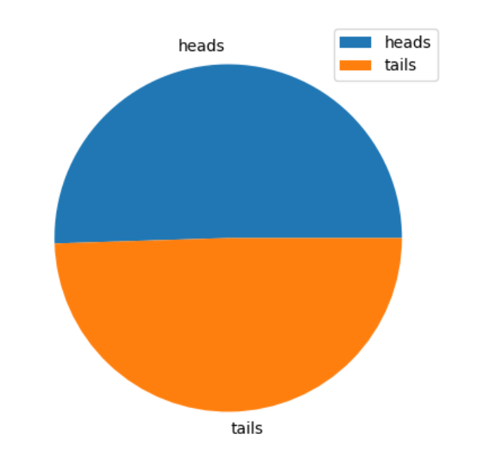
We can use Python to illustrate this idea, showing 10,000 trials and seeing the probability of coin toss.
import random
from matplotlib import pyplot as plt

heads_tails = [0, 0]
trials = 10000
trial = 0

while trial < trials:
    trial = trial + 1
    toss = random.randint(0, 1)
    heads_tails[toss] = heads_tails[toss] + 1

plt.figure(figsize=(5,5))
plt.pie(heads_tails, labels=['heads', 'tails'])
plt.legend()
plt.show()
This will plot this graph:
In independent events combination, we have a different problem. For example, what is the probability of getting three heads in a row?
To combine these independent events, we need to multiply the probability of each event. In this case, it's 1/2 · 1/2 · 1/2 = 0.125, or 12.5%
Let's try it with Python: running random trials and see how it approximates to the probability of 12.5%.
import random

h3 = 0
results = []
trials = 10000
trial = 0

while trial < trials:
    trial = trial + 1
    result = ['H' if random.randint(0,1) == 1 else 'T',
              'H' if random.randint(0,1) == 1 else 'T',
              'H' if random.randint(0,1) == 1 else 'T']
    results.append(result)
    h3 = h3 + int(result == ['H', 'H', 'H'])

"%.2f%%" % ((h3 / trials) * 100) # 12.56%
Intersection
In intersections, we can think of Event A and Event B occurring.
- We have the Event A
- We have the Event B
- We have the sample points when A and B intersect
Here's the notation for the combined event probability:
The probability of events A, B, and C occurring. This symbol represents "and".
Union
The union's symbol represents "or". Looking at the venn diagram, we can see the sample points in the event A and B but we need to subtract the intersection of A and B (A ⋂ B) to avoid double-counting.
Dependent Events
To illustrate the concept of dependent events, let's take a deck of card as an example.
A deck of cards has 52 cards:
- 13 spades (black cards)
- 13 clubs (black cards)
- 13 hearts (red cards)
- 13 diamonds (red cards)
The probability of getting a black card is 13 (spades) + 13 (clubs) divided by 52 (the total number of cards).
We use the same process to calculate the probability of getting a red card. Rather them counting spades and clubs (black cards), we count hearts and diamonds (red cards).
After getting one card and not replacing it back to the deck of cards, the probability of getting a new cards changes.
Imagine we get one card and that one is a red card (diamond). This is what happens.
For the first card, the probability is:
- For black cards, we have (13 + 13) / 52
- For red cards, we have (13 + 13) / 52
After getting the red card and not replacing back, now we have 51 cards in the deck and only 12 rather 13 of diamonds. So it looks like this now:
- For black cards: (13 + 13) / 51 (now with 51 cards in the deck)
- For red cards: (13 + 12) / 51 (now with 51 cards in the deck and only 12 of the diamond cards)
One event is affecting another. This is called dependent events.
The notation for dependent events:
We can interpret this as the probability of B, given A. Given that the event A happended, what's the probability of the event B.
Suppose the first card drawn is a spade, which is black. What is the probability of the next card being red?
Mutually Exclusive Events
Mutually exclusive events are when events don't occur at the same time.
An example of this is coin toss getting heads and tails.
- The intersection of a mutually exclusive event is always 0
- The union is the sum of the two events, there's no need for the subtractation of the intersection because the intersection of mutually exclusive events are always 0
Binomial Variables
A binomial variable is used to count how frequently an event occurs in a fixed number of repeated independent experiments.
The event in question must have the same probability of occurring in each experiment, and indicates the success or failure of the experiment; with a probability p of success, which has a complement of 1 - p as the probability of failure.
In n experiments, we want to choose k successful results. This is known as n choose k. This is the notation:
And here's the formula
In the case of 3C1 calculation, this means: